
Burgundy wedding: colours, pairings and how they photograph
IN SHORT
A burgundy wedding builds its palette around deep wine red, usually softened with plum, olive green, blush and cream. On Pinterest, searches for burgundy weddings grew by roughly 55 percent in the UK and 30 percent in the US between September 2025 and September 2026, while sage green, the favourite of recent years, fell. The colour works best from late summer into winter and photographs well when the dark tones have light around them.
QUICK FACTS
Colour: deep purplish red, named after Burgundy wine, hex #800020
Trend on Pinterest: “burgundy wedding” about +55 % in the UK and +30 % in the US year on year (September 2026)
Related searches rising: plum and olive wedding, merlot wedding, fig wedding, muted terracotta
Colour it is replacing: sage green, down about 60 % in the US and 30 % in the UK
Best season: late August to February
Works with: plum, olive, blush, cream, warm gold, dark wood
A burgundy wedding uses deep wine red as its main colour, and in 2026 it is one of the few wedding palettes that is growing on Pinterest in both Europe and the US. The shift is easy to see in the numbers. Couples who a few years ago pinned soft sage green and eucalyptus are now saving darker, warmer rooms: wine red flowers, plum velvet, olive branches and candlelight.
This guide is for couples who are drawn to that feeling but are not sure how to use it. Burgundy is a strong colour. Used everywhere, it can make a room feel heavy. Used with care, it gives a wedding depth and warmth that lighter palettes cannot. Below you will find what the search data actually shows, which colours sit well next to burgundy, how the palette changes with the season, and what to think about if you want your photographs to carry the colour as well as the day did.
I am a wedding photographer, so the angle here is practical and visual. Colour is one of the first things a couple decides, and one of the things that shows most clearly in the pictures you keep. If you are also planning the venue, the guide to wedding venues in Stockholm is a good place to start, because the room you choose will decide how dark a palette you can carry.
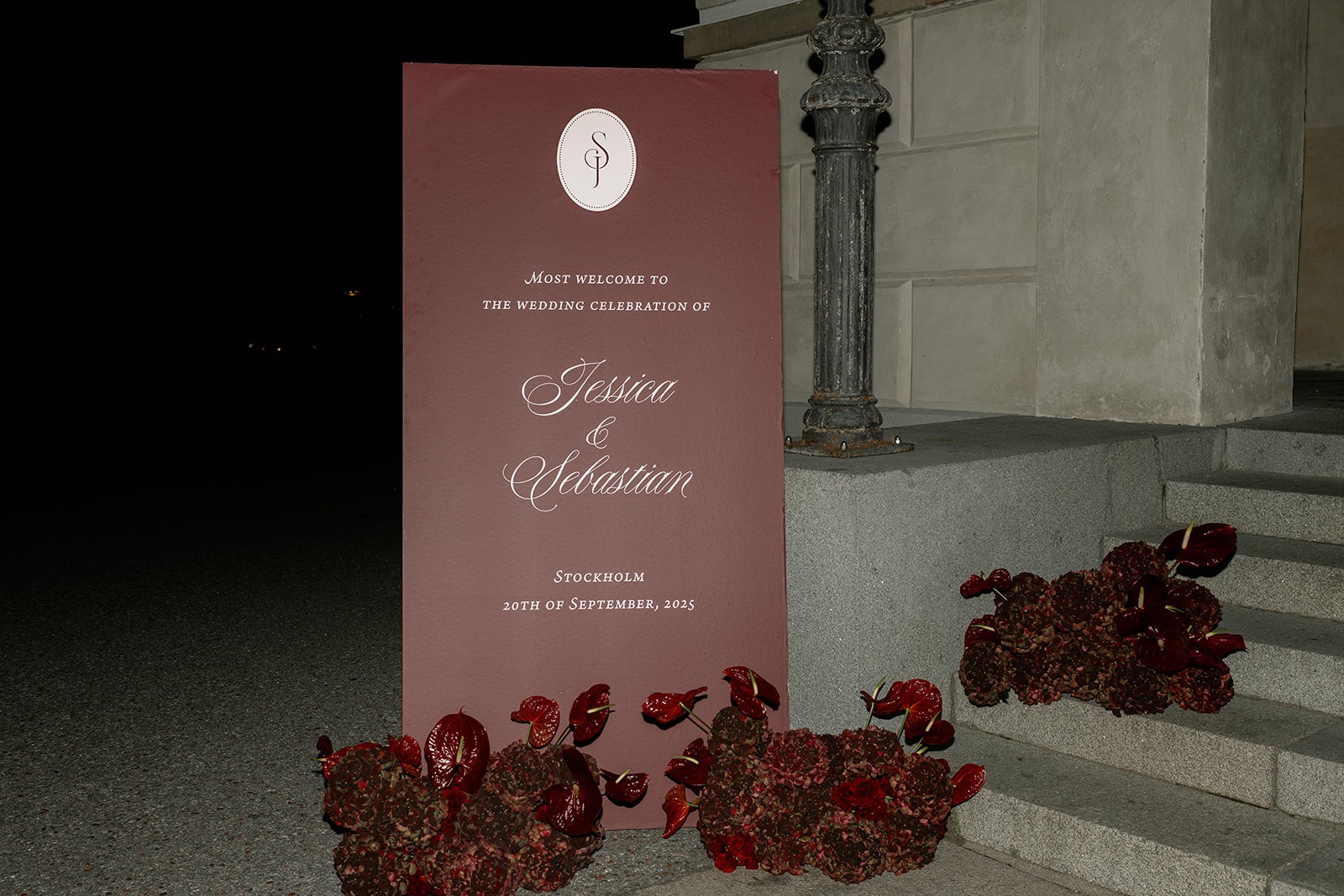
What is a burgundy wedding?
Burgundy is a deep red with a touch of purple. According to Wikipedia, the colour takes its name from the wine of the Burgundy region in France, and the first recorded use of “burgundy” as a colour name in English dates from 1881. Close relatives are claret, maroon, mulberry and merlot, which is why couples search for all of them when they mean roughly the same thing.
A burgundy wedding does not mean that everything is red. In practice it means one deep anchor colour that returns in a few chosen places: the bouquet, the bridesmaid dresses, the napkins, the wax seal on the invitation, perhaps the ribbon on the cake. Around it sit calmer tones that let the red breathe.
That is also what separates it from a classic red wedding. Bright red reads as festive and loud. Burgundy reads as quieter and more grown up. It belongs to candlelit dinners, old stone walls, dark wood and heavy linen, which is why it suits castles, manor houses and city hotels with history in the walls.
Is burgundy a wedding trend in 2026?
Yes, and the data comes from Pinterest itself. Pinterest Trends shows how search interest for a term develops week by week in different regions. Comparing September 2025 with September 2026, the search “burgundy wedding” rose by roughly 55 percent in the UK and Ireland and by roughly 30 percent in the US. In the US, interest peaked in January 2026, which is when most couples sit down to plan the year ahead.
At the same time, the palette that dominated the last few years is fading. Searches for “sage green wedding” fell by about 60 percent in the US and about 30 percent in the UK over the same twelve months. By September 2026 the two were searched at about the same level in both countries. The direction is clear: couples are moving from light and airy towards deep and warm.
The shift shows up in Pinterest’s own Wedding Trends Report 2026 as well. Under a theme it calls “Rooted Romance”, the report lists growing searches for plum and olive weddings (+1,380 %), plum wedding themes (+630 %), fig weddings (+515 %), muted terracotta (+545 %), merlot weddings (+370 %) and raspberry weddings (+330 %). Those percentages are global and describe growth from a small base, so they say more about direction than size. Taken together with the regional burgundy numbers, they point the same way.
One word of caution. The combination “plum and olive wedding” had a sharp peak in the US in February and March 2026 and has since fallen back. Burgundy as a broader colour family is the steadier signal, which is why this guide treats plum and olive as partners to burgundy rather than as a palette of their own.
Which colours go with burgundy?
The simplest way to build a burgundy wedding palette is to choose one deep colour, one neutral and one softener. Burgundy is the deep colour. The neutral holds everything together, and the softener stops the palette from feeling dark.
Burgundy and olive green
Red and green sit opposite each other on the colour wheel, so they make each other look stronger. Olive is a muted, greyish green, which keeps the contrast from turning into Christmas. Olive branches in the table runner, olive-toned bridesmaid dresses or simply a lot of natural greenery all work. This is the combination behind the “plum and olive” searches, and it suits outdoor ceremonies in late summer.
Burgundy and plum
Plum pulls burgundy towards purple and makes the palette feel softer and more romantic. Because the two colours are so close, the combination needs a light neutral next to it, otherwise the tones blur together. Plum works well in velvet, in dahlias and in ribbon, and less well in large flat surfaces like tablecloths, where it can read as brown in low light.
Burgundy, blush and cream
This is the lightest version and the easiest to get right. Cream tablecloths, blush roses and a few burgundy accents give the depth without darkening the room. It is a good choice for a daytime ceremony, for a venue with white walls, or for couples who like the colour but do not want the whole day to feel autumnal.
Burgundy and warm gold
Gold candlesticks, brass details and warm lighting bring out the red in burgundy. This is the palette for evening receptions and winter weddings. Keep the gold warm and a little worn rather than shiny, otherwise it competes with the red instead of lifting it.
Burgundy wedding palettes compared
| Palette | Feeling | Where it shows | Best for |
|---|---|---|---|
| Burgundy and olive | Natural, earthy, strong contrast | Greenery, bridesmaid dresses, table runners | Outdoor ceremonies in late summer and early autumn |
| Burgundy and plum | Soft, romantic, tonal | Velvet, dahlias, ribbon, stationery | Autumn weddings in rooms with light walls |
| Burgundy, blush and cream | Light, warm, easy to balance | Roses, tablecloths, cake | Daytime weddings and couples new to dark colours |
| Burgundy and warm gold | Evening, candlelit, formal | Candlesticks, cutlery, lighting | Winter weddings and black tie receptions |
| Burgundy and terracotta | Warm, rustic, sunny | Pottery, dried flowers, linen | Destination weddings in southern Europe |
When does a burgundy wedding work best?
Burgundy belongs to the darker half of the year. The Pinterest data follows the calendar: interest rises in autumn, peaks around January and February when couples plan, and dips in early summer. That does not mean a June wedding cannot use the colour, only that the palette needs more light around it then.
Late summer and early autumn. This is where burgundy and olive feel most natural. Gardens still have green, and dahlias are in season; the Royal Horticultural Society notes that they flower from summer through autumn until the first frosts. Burgundy and deep red dahlias are one of the easiest ways to bring the colour into a bouquet without it looking forced.
Late autumn. The light is lower and warmer, and the palette can go deeper. Plum, fig and dried elements fit well. Indoor receptions start earlier in the evening, so candlelight becomes part of the colour scheme.
Winter. Burgundy with warm gold, dark greenery and plenty of candles. Velvet and heavier fabrics make sense here, both for guests and in the decor. A winter wedding in wine red has a very different mood from the classic white winter wedding, and it tends to feel warmer on a cold day.
Spring and summer. Keep burgundy as an accent. A few dark roses in a light bouquet, a burgundy ribbon or a single deep colour in the stationery gives the reference without fighting the daylight.
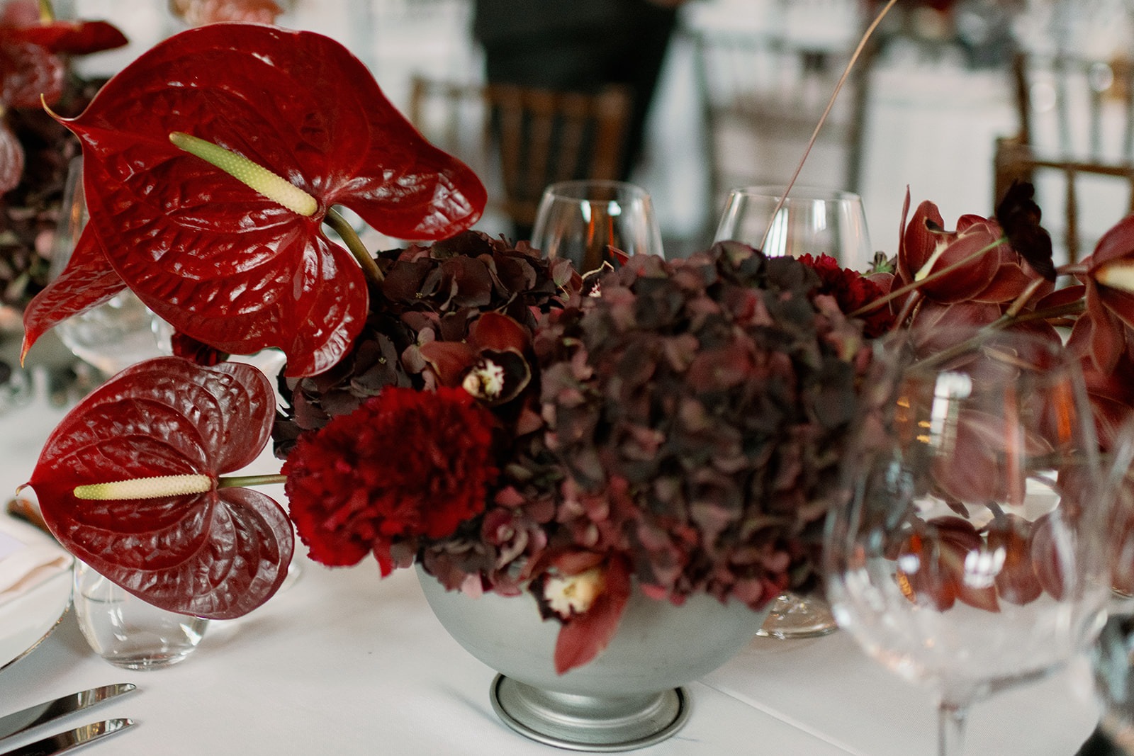
Where to use burgundy on the wedding day
Choose three to five places for the colour and let everything else stay calm. Repetition in a few spots reads as intentional. Colour everywhere reads as a theme.
Flowers. The bouquet is usually where the palette starts. Dark dahlias, deep red roses, ranunculus and scabiosa can all carry burgundy, with olive or eucalyptus for green. A bouquet that mixes dark and light flowers photographs better than one that is dark all through, because the lighter blooms give the eye something to rest on.
What the wedding party wears. Burgundy bridesmaid dresses are a common choice, and olive or plum mixed in works if you want variation. For the groom or a bride in a suit, burgundy tends to show up in a tie, a pocket square or a velvet jacket rather than a full suit. If a suit is part of your plans, the guide to bridal suits covers how that trend has developed. Guests can be given a hint too; the wedding guest dress guide explains how dress codes work in practice.
The table. Napkins, candles, glassware and a table runner are the most flexible places for colour. Tinted glass in wine red or smoke, cream plates and linen napkins in burgundy give a lot of effect for a small change. Keep the tablecloth light unless the room is very bright.
Stationery and details. Invitations, wax seals, place cards and menus let the colour appear before the day and tie the pictures of details together afterwards.
The dress. Most brides in a burgundy wedding still wear white or ivory, which is part of why the palette works: the dress becomes the lightest point in every picture. A warm ivory sits more naturally next to burgundy than a cold, bright white. The post on timeless wedding dresses has more on choosing a simple dress that lets the surroundings carry the colour.
How does burgundy look in wedding photos?
Dark colours absorb light. That is the whole reason burgundy feels warm and deep in a room, and it is also what couples should keep in mind for the pictures. A burgundy velvet dress in a dim corner has very little detail for a camera to hold on to. The same dress next to a window glows.
A few things make a clear difference. Give the darkest elements light: place the bouquet table, the cake and the bridesmaids where daylight or warm lamps reach them. Balance dark and light in the same frame, so a white dress, cream linen or pale stone gives contrast. And be careful with coloured lighting at the party. Red or purple uplights on a burgundy room turn everything into one tone and make skin look flushed.
Burgundy also changes more than light colours do between daylight and evening. In daylight it reads as red. In warm candlelight it moves towards brown and plum. Neither is wrong, but it helps to know that the colour you chose from a fabric sample in a shop will not look identical at nine in the evening.
In black and white, burgundy becomes a deep grey that sits close to black. That gives strong, graphic portraits, especially next to a white dress, and it is one reason a dark palette can work well for couples who love documentary black and white images.
Common mistakes with a burgundy wedding palette
Too much of it. Burgundy tablecloths, burgundy chairs, burgundy flowers and burgundy dresses in one room become a wall of colour. Pick the places that matter most and keep the rest neutral.
A dark room with a dark palette. A cellar vault or a room with dark wood panels already brings the depth. Adding a dark palette on top can make the space feel closed. In rooms like that, lean towards the blush and cream version.
Mixing too many reds. Burgundy, cherry, coral and hot pink in the same bouquet fight each other. Stay within the wine family (burgundy, merlot, plum, fig) and use blush or cream as the light tone.
Forgetting the green. Without any green or neutral, a burgundy palette can feel flat. Olive, eucalyptus, moss or simply natural foliage gives it life.
Choosing only from screens. Burgundy varies a lot between screens and in print. Order physical fabric and paper samples and look at them both in daylight and under warm light before you decide.


A photographer’s perspective

My name is Karin Lundin and I am a wedding photographer based in Stockholm. I photograph a limited number of weddings each year, mostly in Sweden and across Europe, and this year some of them were built around plum, olive and deep wine tones.
What stays with me about a darker palette is how much it depends on light. The same colours that feel warm and close at the dinner table need a window, a lamp or the last daylight to show their detail. That is worth thinking about when you plan the timeline, not only the flowers. The wedding day timeline guide shows how to place portraits and details where the light is.
You can read more about me and my background, or see how I approach fine art wedding photography in Sweden.
Want to capture the day on film as well? I often work alongside Nordvér Films.
Key takeaways
- Searches for “burgundy wedding” on Pinterest rose about 55 % in the UK and 30 % in the US between September 2025 and September 2026.
- Sage green fell about 60 % in the US over the same period, so the move is from light green to deep red.
- Build the palette from one deep colour, one neutral and one softener, for example burgundy, cream and blush.
- Olive gives the strongest contrast, plum the softest and warm gold the most evening feel.
- Burgundy fits late August to February best; in spring and summer, use it as an accent.
- Give dark elements light and avoid red or purple uplights, or the colour disappears in the pictures.
- Check fabric and paper samples in both daylight and warm light before deciding.
Frequently asked questions
What colours go with a burgundy wedding?
Olive green, plum, blush, cream and warm gold are the most common partners. Olive gives contrast, plum keeps the palette tonal, and blush and cream lighten it. Dark wood and candlelight also suit burgundy well.
Is burgundy still popular for weddings in 2026?
Yes. Pinterest Trends shows searches for “burgundy wedding” up about 55 percent in the UK and about 30 percent in the US from September 2025 to September 2026, while sage green declined over the same period.
Can you have a burgundy wedding in summer?
You can, but use burgundy as an accent rather than the main colour. A few dark flowers in a light bouquet, a burgundy ribbon or stationery details work well in daylight. The full, deep palette suits late summer to winter better.
What is the difference between burgundy and maroon?
Both are deep reds. Burgundy has a slight purple tone and is named after Burgundy wine, while maroon leans more towards brown. For wedding planning the difference is small, but it matters when you match fabrics and flowers from different suppliers.
Which flowers work for a burgundy wedding bouquet?
Dark dahlias, deep red roses, ranunculus and scabiosa are common choices, with olive or eucalyptus for green. Dahlias flower from summer until the first frosts, which makes them a natural choice for late summer and autumn weddings.
Does burgundy look good in wedding photos?
Yes, when it has light around it. Dark colours absorb light, so burgundy details look best near windows or warm lamps and next to lighter elements like a white dress or cream linen. Avoid red or purple uplighting, which flattens the colour.
What should wedding guests wear to a burgundy wedding?
Guests do not need to match the palette. If the couple wants a hint, neutral or muted tones like olive, navy, cream or dusty pink sit well next to burgundy. Guests should avoid white and ask the couple before wearing burgundy themselves if the wedding party is in that colour.
Is plum and olive the same as a burgundy wedding?
They are close relatives. Plum and olive is one version of the broader wine red palette. On Pinterest, “plum and olive wedding” had a short peak in early 2026, while “burgundy wedding” has grown more steadily, so burgundy is the wider and more stable choice.